
We come across many different scenarios where resizing a component becomes very important to support an excellent responsive UI. Resizing is required during browser window resize, mobile view etc. There are many react re-usable libraries which help in resize but have problems of their own. These libraries adjust the size of components when it is mounted on DOM and doesn’t scale dynamically when a browser window is resizing.
With this background let us go case by case.
Case 1: Resizing using CSS
This is a scenario where we require to beautify the UI from a 2-column layout to a single-column layout. Even you can reduce the padding between 2 rows on a small width browser/ a mobile view or such similar minimum changes.
So, for this we can use the snippet mentioned below:
@media only screen and (min-device-width: 375px) and (max-device-width: 812px) and (-webkit-min-device-pixel-ratio: 3) {
  .sp-pageLayout-navBelowHeader div[class*="belowHeader_"] {
    overflow-y:auto !important;
  }
@media screen and (min-width: 641px) {
.CanvasSection--read .ControlZone {
margin-top: 0px !important;
}
}Case 2: Resizing Using JavaScript
However, the above usage does not look dynamic and the change of entire UI based on different window size is not possible. As required in many cases, the idea to re-render the react component each time the browser window changes its size becomes important.
In the background, we need to recalculate the new dimension for our component and render it back with a new size and structure. But the intelligent question is what to set as a trigger, for calling this JavaScript?
Let’s see the example below:
public componentDidMount() {

window.addEventListener('resize', (e: Event) => {
      this.handleResize(window,e);
    });

  }

handleResize(webpartboundary, event:Event):event is CustomEvent  {
   this.setState({WindowSize: webpartboundary.width});
   return 'detail' in event;
 }

componentWillUnmount() {
window.removeEventListener('resize', (e: Event) => {
      this.handleResize(window,e);
    });
}

public render(items: INewsItem[], isEditMode: boolean,viewmorelink:string,windowsize:number): JSX.Element {


const ImageElem = items.map((item, index) => {
	//return a html for the view

}

const CarouselElem = items.map((item, index) =>(
	// return a different view html
));
        return (
            <div className={styles["newscontent"]}>
            {(windowsize > 600) &&<div>
                {/* <span>Five Tile Layout</span> */}

                <div className="ms-Grid">
                <div className="ms-Grid-row">
                        {ImageElem}
                    </div>

                </div>
                <a className={styles.viewAllLink} href={viewmorelink}>{strings.ViewMoreLinkLabelForFiveTiles}</a>
            </div>}
            {(Utils.isMobile.any() ||  windowsize < 600) && <div>
                <Carousel RenderElement={CarouselElem} />
                </div>}

            </div>
        );
}
In the code written above, we are trying to render a 5-tile view (similar to HERO webpart) in normal desktop width, and a Carousel in mobile view or reduced width. And we have kept the benchmark width as 600px. This is a standard way to resize a component using JavaScript, and yes, it is the most used one.
But there is still a limitation in the above usage which needs to be discussed before coming to the third case.
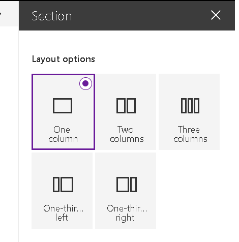
Many times, we require to place the web part in a smaller size section column. SharePoint comes with its own layout where there are options to place the web part in either a single column layout, two column layout, three-column layout, One-third left or One-third right layout. For example, if we place the react webpart in a three-column layout it should behave like a reduced browser window size.
Hence, whenever the column width is too small, we should render a smaller view rather than a full window view for that react web part. Therefore, if we take the window size as the parameter for state change, we cannot achieve this. Alternatively, we need to get an area where the web part resides and use it as the decisive factor instead of window width.
For this we can use the snippet below:
this.domElement.getBoundingClientRect().widthHowever, we don’t get access to the DOMElement in the component DidMount of the react component, as React components don’t allow the direct DOM manipulation.
So how to achieve this?
Case 3: Resizing of React Web Part Using Section Column Width
In the webpart.ts the entry file for a web part where we instantiate the React component, write the below piece of code to pass the DOMElement as the props.
public render(): void {
    const element: React.ReactElement<IShNewsAnnouncementProps > = React.createElement(
      ShNewsAnnouncement,
{
WebpartElement:this.domElement
}
Now rewrite the above code of resize in the below fashion.
constructor(props: IShNewsAnnouncementProps) {
    super(props);
    this.state = {
WindowSize:this.props.WebpartElement.getBoundingClientRect().width

}
public componentDidMount() {
window.addEventListener('resize', (e: Event) => {
this.handleResize(this.props.WebpartElement.getBoundingClientRect(),e);
});
}handleResize(webpartboundary, event:Event):event is CustomEvent {
this.setState({WindowSize: webpartboundary.width});
return 'detail' in event;
}componentWillUnmount() {
window.removeEventListener('resize', (e: Event) => {
this.handleResize(this.props.WebpartElement.getBoundingClientRect(),e);
});
}Summing it up at the end, with this above code, we can achieve the below scenarios of resize.
- Component renders view changes when browser window resizes.
- Component renders view changes if the column width of the webpart is small (based on our benchmark width).
- Component renders view changes if launched on mobile.


Hi there,
I followed the directions and received a react error message and the webpart did not render:
https://reactjs.org/docs/error-decoder.html/?invariant=31&args%5B%5D=object%20with%20keys%20%7B%7D&args%5B%5D=
Objects are not valid as a React child (found: object with keys {}).
In my react component props, I have added this type:
WebpartElement: HTMLElement;
I also added all the functions and references mentioned in “Case 3”. I don’t receive any tslint warnings in VSCode either. Webpart just plain does not load.
Update to my last comment… I started from scratch and no longer get the error.
My question though is you are using getBoundingClientRect().
When I look at the element object in the console that I passed down, I also see this directly:
offsetWidth: 1117
And in the offsetParent object, I see tehh same thing… offsetWidth: 117
So I’m just curious if this is a newer update to SPFx or what?
Thanks for a great post!
Good to hear you were able to get this without error. Offsetwidth is an html property of width of an element which includes border, padding , vertical scrollbar