
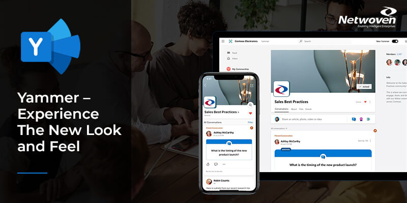
It is claimed that styling across the whole application has been sharpened and modernised, making content clearer and more visually engaging. I took a dive into it and here is my take on it as I moved around a bit. The idea is to share my experience with you and also wanting to know what you think about it!
Socializing with Social Distancing
If not for anything else, the Covid-19 caused social distancing is teaching me to make peace with myself and my surroundings. So, given a chance to step out, I just ventured out from my organization’s mundane messenger network into the newly branded Yammer and am trying to enjoy it on my own.
What got changed while everyone is indoors?
Upon a return to my workplace after a sabbatical of almost 7 months, the first change which I perceived was when I logged into Yammer. Instead of an ordered listing, I have enumerated below the same in the order of my perception.
URL
Yammer now has a new address (read URL). Toggle to turn ON the Try the new Yammer on the right of the ribbon to notice the change.

UI
It feels amazingly refreshing with a rearranged UI, not forgetting what is absolutely striking about this change is the new splash of colors on the icons.


What I also like about this change is the attempt to transgress to a social platform which can be seen in the change of update prompt from ‘What are you working on’ to ‘Share an idea, ask a question, or post whatever’s on your mind’.
Also as compared to the former vertical grey and white banded journal look, the new look has a seamless background with floating left and right navigations over it and a prime central holder of content.
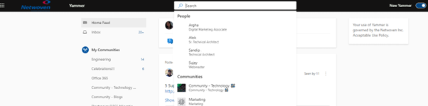
While Yammer is an enterprise social network for collaboration across one’s organization, in its not-so-old look, I still despise the sight of the Suggested People, Suggested Group, Option to Invite Coworkers et all on the right navigation. They make me feel as one is mandated to remain officially engaged in the same fraternity, under the garb of socializing. However, the new look has the Search text box at quite an identifiable placement which seems to be quite a smart strategic positioning and the moment you click in it to type, here pops up those done-away-with suggestions, and this time quite tastefully done. Such a display is quite inviting to check updates from fellow coworkers.
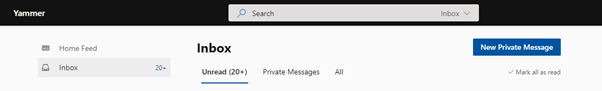
Private Messages
The former look had a dedicated Private Messages feature on the home page.
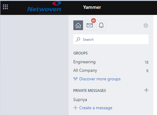
This feature did seem quite redundant, since clicking on the Inbox icon on the top opened the detailed messaging page.
The new look opens the same messaging page, however, with a cleaner access with just a click on the Inbox icon.
Groups
They are now called Communities and the ones that have you as member are grouped under My Communities in the left navigation. However, the URL of this page still remains same as the old one with the subdirectory in the URL containing the mention of ‘/groups‘. The removal of quick launch on the new Communities page gives it quite a deserted look.
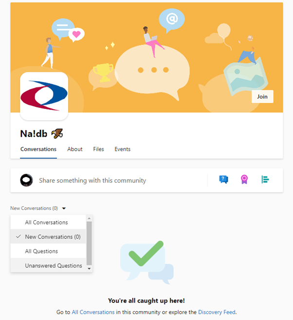
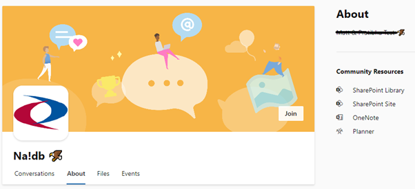
When I navigate to the Communities page of which I am member of, I like the clean tabbed like navigation to view Conversations, About, Files and Events which saves quite a bit of effort scampering around to discover more about the Group/Community.

Are changes just aesthetic?
Not all of them. Beauty comes as much from the mind as from the eye. So, the utility of functional changes depends on its use. I’m evaluating only a few features that I frequently use, narrowing down from the general to more specific, beginning with my own profile.
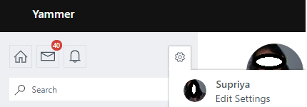
Profile
The former look had a gear wheel icon, clicking on which I got a glimpse of my Yammer activity by clicking on my name.
I have not yet seen its counterpart on the new Yammer. This is surely missed since I lose the opportunity to modify my footprints or choices here.

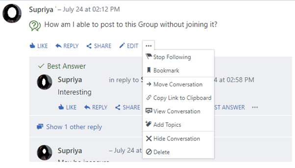
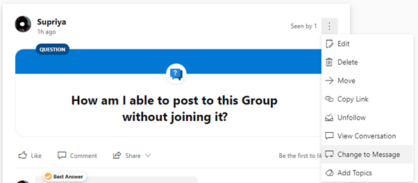
Question
Posting a question on the former and New Yammer indicate a lot of changes – not just in wordage, but also removal and addition of a few features.
While I’ll compare the features between the two looks, the option to respond to Questions is indicated as Comment instead as Reply which seems a bit out of place.
Old Yammer
New Yammer
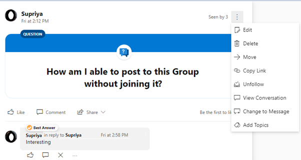
If one is adept in using the former Yammer, the following table of comparison will surely be handy to know the changes.
| Former Yammer | New Yammer | Feature Comparison |
| Stop Following | Unfollow | No change |
| Bookmark | – | Unavailable |
| Move Conversation | Move | No change |
| Copy Link to Clipboard | Copy Link | No change |
| Hide Conversation | – | Unavailable |
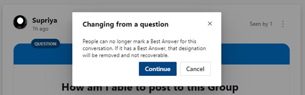
| – | Change to Message | New (transforms Question to message) |
My personal loss here is the removal of Bookmark, however I like the new feature to Change Question to Message.
Communities
I now move into Communities (formerly known as Groups).
The second thing (I already mentioned earlier that I like the new tabbed look) that I like here is the option to view Conversations and Questions separately, not forgetting New Conversations and Unanswered Questions.
Office 365 gives an option to create a Yammer connected SharePoint site. For such sites, discussions take place in yammer and referencing to all files or resources happen on SharePoint site.
In the new look if one is trying to find Office 365 Resources linked to this Yammer group, a naive attempt would be to click on Files. However, this got moved to ‘About’.
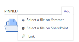
Pinned
By the virtue of being member of a Group (Community), members get an option to Pin files or links that are important to the group. Though this feature is retained in the New Yammer, the options have reduced.
The Old Yammer along with adding link also supported selecting files on both Yammer and associated SharePoint sites, however the new yammer only allows addition of link.
Old Yammer
This was a great feature since the file selections not only allowed browsing through all yammer groups that the user is part of and the associated SharePoint sites, but also allowed user to select the type of file.
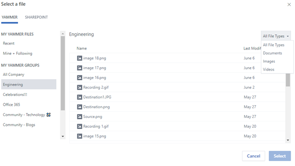
In short, it reduced the effort of looking up the file path to add as link, unless it was outside the environment by a simple browsing process.
New Yammer
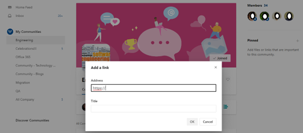
For sure, the change in Pinned feature is definitely one that I don’t like much for now.
Do these changes sum up the New Yammer?
No! There are also changes in various menu options of posts/updates, but for now I would like to focus only on the striking changes.
I am wrapping up my lone tour of recce of the new environment with only these discernible changes while I presume the Yammer team of stylists and programmers are still working on more. Let me know what you think about the New Yammer.


Very descriptive post, I liked that bit. Will there be a part 2?
As long as technology keeps evolving, there’s never an end, stay tuned!